Visual Style guide
This guide is work in progress and subject to changes and expansion and elaboration mostly.
Discussion topic: [1]
Before you want to start contributing any art asset to Pioneer, there are some things good to know. First of all, this style guide exist to aid the creation of a consistent game look and to support a fun and interesting asset creation experience, and to provide motivation to the contributors. Free for all is a nice thing, but common ground and aim is important for interesting and fun long term work. Imagine Andromeda Ascendant and the Millennium Falcon and NNC-1701 USS Enterprise standing next to each other. They are nice ships on their own right but they would look quite strange and out of place compared to the other two. This is why these guides exist. To push ourselves from a noisy cacophony to an interesting tune with nice rhythms. You will notice that these guides are not that rigid and allow for quite a good amount of invention and playing around with ideas. They are to give a frame and to boost creativity, not to hinder and cage it.
About the background:
Pioneer is space simulator game, aiming for a certain degree of realism, but it's a science fiction game nonetheless, so some things are tweaked or excluded. Engines are quite powerful and efficient for example, but they are not the weapons of mass destruction their power would indicate. Distances and sizes are realistic, which makes the universe a vast and interesting place. Gravity is simulated too, so you should consider it when coming up with a ship. Relativistic effects are not simulated, so there's no delay due to speed of light and such.
Technological background of the universe is decidedly low-key, with as little handwavium or technoblable as possible, but a space opera nontheless. The largest exception is the presence of hyperdrive which allows the above mentioned scale of the game. It doesn't give instantaneous travel though. Travel times are measured in days and even weeks.
Engines are very powerful and efficient, without too much explanation, mainly for game-play reasons, but that's subject to some muting and fine-tuning in the future. This also allows for a hint of space opera aesthetics, but the aim is to have believable spacecrafts and habitats.
Thermodynamic issues are sidestepped in a similar fashion. There are some heat sinks, but they are there as a nod to the heat problem.
Spaceships are subject to Newton's laws of motion. There are no arbitrary speed limit except propellant capacity and the engine's exhaust velocity. You won't stop moving after you cut your engines, you need to thrust on the opposite direction. You need maneuvering thrusters and propellant for attitude control and maneuvering. Gravity is simulated (only on a two body level, there aren't any pertubations, and planets are on rails), so you can orbit around bodies and do orbital maneuvers.
There are other missing technologies or tropes for game-play reason too. Sentient AI is generally not there, because that would make human pilots obsolete. Time acceleration is only for the comfort of player, there's no stasis or anything connected to it. You can consider it as part of the UI.
Similarly there aren't any replicator nano-assembler/disassembler or similar technology. That would make any trading irrelevant, and would create a society quite different from anything we know to hinder immersion.
The only way of superluminal communication is the usage of specialist courier craft network that jumps from system to system, and broadcast the messages and contents. This also makes courier and messenger tasks possible for the player. In-system communication is instantaneous (there's no simulation of speed of light).
There aren't any artificial gravity or any kind of gravity manipulation technology. Gravity can be simulated by rotating sections and station structures, or by thrusting. So down is in the opposite direction of thrust.
Backdrop
The main backdrop in the historical core systems is a tense but solidified cold-war-like situation between the more expansionist/imperialist and proud Solar Federation (SolFed) and the separatist/independence advocate Confederation of Independent Worlds (CIW or CIS). Scientific advancement is decelerated but steady due to increasing complexity and unavoidable specialization. It's common to see ship types that are in service for centuries without any groundbreaking modification apart from a small but steady increase in performance.
General Style
The general mood of the game tries to strike a good balance of believability and science-fiction. There's a hint of retro or low-tech in the visuals in the spirit of nice shapes and proportions and humanistic approach. post WW II. era aircrafts, trains and car designs, Streamline Moderne are a good source of inspiration for example. Avoid anything too modern, like an F35 and the drone kin. Of course this doesn't mean a forced nostalgic feel, but a general direction to draw inspiration from.
Some more examples of more specific sources of inspiration:
- Cowboy Bebop and it's everyday mood regarding to both space hardware and general setting.
- Planetes with it's generally believable depiction of space travel and it's nuances.
- Masters of Time (Les Maîtres du temps) by René Laloux, designed by Jean Giraud (Moebius)
- Streamline Moderne of Art Deco for it's grandness, especially for the Solar Federation
- Bauhaus' approach to humanism and clean visuals.
- Car and train manufacturers like Trabant, IFA, DMC, Ganz, or the Luhanskteplovoz among others.
- The illustrations of Peter Elson, especially the low amount of greebling and the use of form and color instead.
Remember that this doesn't mean direct copying or paraphrasing any of these into Pioneer, but to draw from mood and general direction of them.
Ship design
General ship design
Ship design, performance and style are indirectly tied to factions. They are manufactured by different shipyards and their licensors, and some of them are related to a faction or two on a level, and some are independent.
Currently there are six shipyards, four of them from the Solar Federation (Albr and OPLI-Barnard's, Auronox, Mandarava-Csepel) and one from the CIW (OKB Kaluri, but at least another or two are planned), and also there's the independent and unreliable Haber Corporation. This is heavily work in progress, and there are some unclaimed ships which will or won't stay around in the future.
The plan is to have at least another one or two CIW related and a similar amount of independent shipyards. These are not intended to be solely ship factories, but they are selling licenses of their ship designs to other factories to manufacture them so they are spread trough the inhabited galaxy (kind of like the ex Soviet block helicopter and aircraft manufacturers around Europe and Asia for example).
Ship designers are advised to first build/model a ship for one of the existing yards More in-depth descriptions, concept sketches and more detailed concept art are in the works, you can already find thumbnails on the dev forums. This is because it's easier to get the hang of overall feel, before creating any new shipyard, especially if there will be only one craft from that yard in the end.
The main ship size for the game is medium. Along the lines of Eureka Maru, Serenity or the Millennium Falcon or The Bebop or the Toy Box. They are ships that are fit for longer travel with some comfort, can house a number of crew. 20-50m length generally.
The ship is the player's avatar, and can not be exited for a walk.
When coming up with a ship, you should consider some points first. Generally, ships shouldn't be photo-realistic, but a very bit of cartoon look (think of Cowboy Bebop or Planetes for example). Never use plain photo textures for details for example. Use them as inspiration.
Size
There should be enough room for equipment, crew, engines, fuel, etc. Or capacities should be believable for the ships size. So no 100t capacity for a fighter. It's surprisingly easy to underestimate volume though, so don't worry. You should always make sure that it can fit the pilot properly. Blender's 3D printing add-on is useful for volume measuring.
One very good reason to have windows, access hatches and airlock on ships is that they indicate the scale very nicely. Be careful with them though, no panorama windows and similar. Military combat ships won't have too much windows anyway, since the pilot is better off hidden in the belly of the ship in a gimbaled cockpit for maximum protection. Headlights and other detail, and even the frequency and scale of those details are also a very good indicator of scale. Don't forget about a nicely laid out paneling too.
As already mentioned above, the most common ship size for Pioneer is medium. Imagine a ship you can live in for several days even if it's a bit cramped. The Natrix, DenebTransport, Venturestar or Malabar are good examples.
There are four docking port size currently in use by stations:
- Tiny: 20m
- Small: 33m
- Medium: 50m
- Large: 100m
Proportions
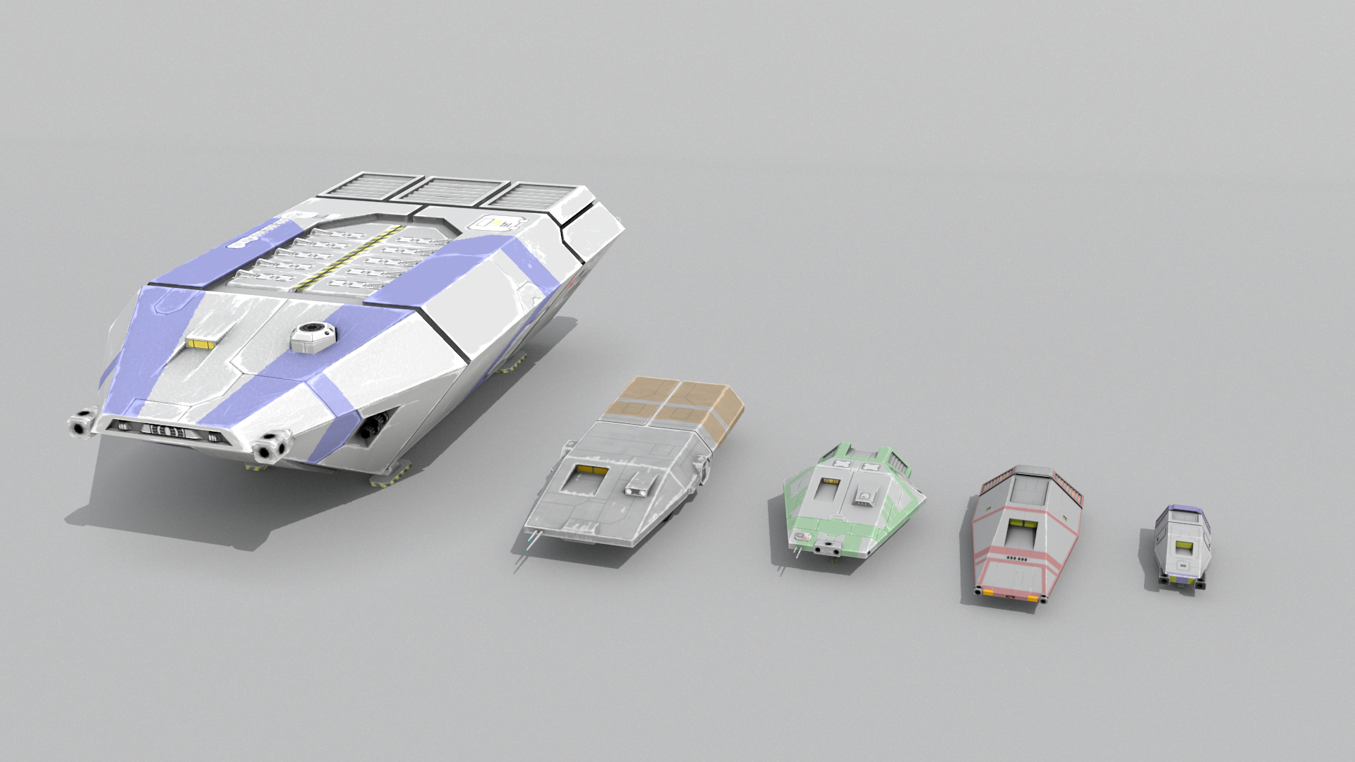
Very important to have ships with nice proportions. Each manufacturer has some preferences in this regard. This is a bit complicated question, since you don't just being mindful the basic dimensions of the ship, but the relative dimensions and placement of parts and details like windows, wings, etc. Very different characters can be achieved by changing some proportion and playing a little with the silhouettes:
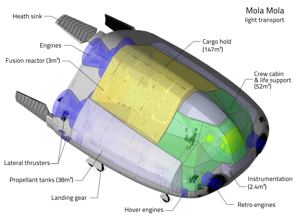
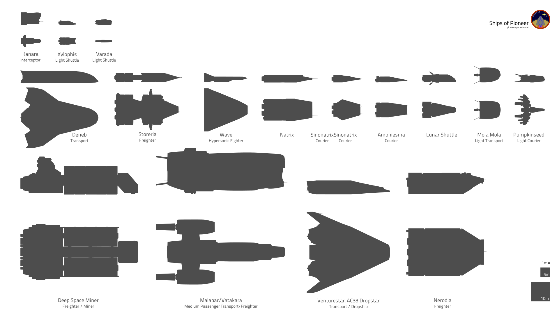
All of these vessels have the same basic build with very minor differences in their overall structure, but they are quite different crafts in the end. Typically ships have somewhat large engines and propellant tanks relative to the overall size. The Mola Mola above is a lower performance and short-mid range ship, so the main mass is the cargo hold and crew compartment. Also it has quite balanced hull proportion. The Kanara Interceptor bellow is much more cramped for example, and it's quite thin compared to it's width and length.
One extreme example is the Wave, which is manufactured in the spirit of chopper motors, building on the history of warcraft creation, so don't expect much comfort from it. It makes up for that with a quite lean and nice form. The crew compartments are quite cramped though.
Silhouette
A good, properly designed and distinct silhouette can make or break a design, so aim for a good one. That's the first thing the brain notices after all. Each manufacturer has their own way regarding their silhouettes.
Design
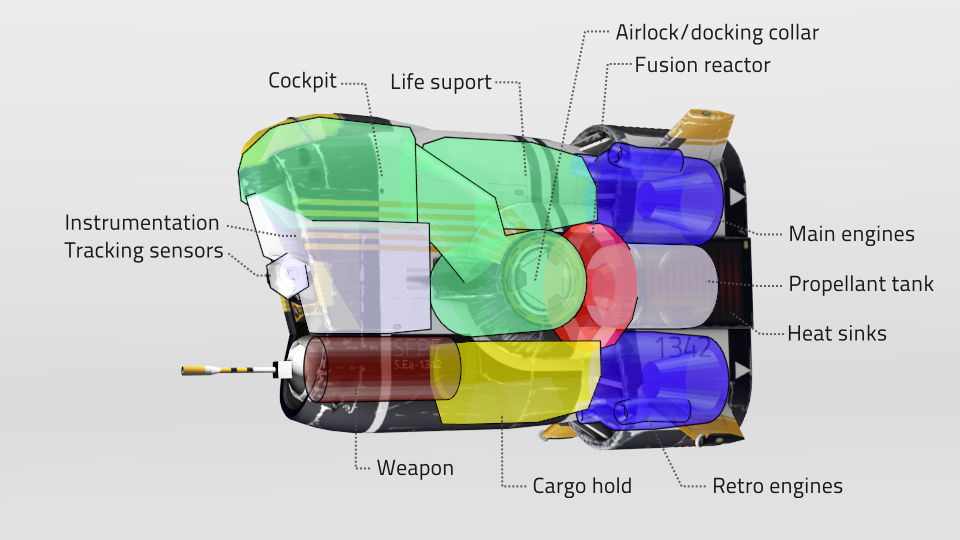
The craft's shape and structure should indicate it's role and it should be thought trough properly. No mindless kit bashing and greebling regarding to details. No need to go too overboard with this, since this is a sci-fi game and not a scientific simulator after all, but put in some thought. A cargo ship should look like it has enough space for cargo for example.
Layout
Atmosphere capable ships can have the more traditional ships in space layout. Don't forget that if the ship is accelerating, the crew and passengers will experience gravity along the line of thrust, so down will be in the opposite direction they are accelerating. Space-only and larger crafts should be laid out more like a skyscraper which works better with the above phenomenon. Generally it's not a problem to have ships with the traditional aircraft layout (floor to the bottom) for the sake of familiarity, but keep in mind that the interior should be convertible for both orientations (there are existing seafaring vehicles that are designed that way). Don't be afraid of the skyscraper way, it can be used quite well. Another important thing to remember that engines should more or less line up with the center of mass of the ship. It's enough to have them in a good place visually, you don't have to make it super precise with mass calculations and measurements. The reason for this is that if the engines are not placed properly, the ship will spin itself while thrusting. This effect doesn't modeled in the game, but that's not a good excuse to be sloppy.
Docking collars
These should be present on all ships (note: most are WIP in this regard, Mandarava-Csepel ships are the good examples)
Currently they are only cosmetic detail, but hopefully ship-to-ship docking will eventually be implemented.
There are four docking collar sizes. All docking collars are round and androgynous, to allow maximum flexibility. Different sizes can still attach, but only in a flimsy manner, since each of them can totally fit into the one size larger. That won't allow towing or such though.
Ships should have their docking collars preferably placed on at least on plane of symmetry, intersection of two is even better. They are preferably perpendicular to one of the axes. The area around the collar should be as clear of obstructions as possible. (Not mandatory, but can cause incompatibilities.)
The diameter of these are (prefab models are WIP):
- A: 1m
- B: 1.83m
- C: 2.68m
- D: 4.79m
Engine size
Engines are relatively large in Pioneer, but not excessively most of the time. Engine size should be proportional to thrust (acceleration). Engine nozzles are usually circular, even if they are put in rectangular housing.
Details
No greebling or mindless detailing for the sake of detail (form and proportion is the main place for creating interest anyway). This includes both modeling and texturing. Look up Horror Vacuii. Detail work should make at least a little bit of sense. Now I understand we aren't spaceship engineers, but the thing is, if the form (or silhouette), the design, the proportions of a ship aren't interesting, then no amount of nonsense extruded paneling and stuff will save it. On the other hand, use this as an opportunity to create interest with form and design instead of baloney detail. There are some good opportunities like heat sinks, airlocks, docking collars and connectors, cargo doors, sensors, (head)lights, plumbing, gridders, handrails, antennas, etc. Check the ship structure article (WIP) for details and ideas.
Texturing and materials
Usually bright colors and a hint of cartoony look. And by cartoony, think mostly of Cowboy Bebop, Planetes, Titan AE and such. Ambient Occlusion should be baked on the texture to accent the form (even though AO isn't that prominent in vacuum, it helps avoiding the paper spaceship feel). Protective tiles and such can be used, especially on areas directly affected by reentry.
There should be visible wear and grime on the texture for a much lively look, but don't go overboard with it. Try to avoid excessive texture overlays (especially tiled plating), those tend to turn the ship into rotting concrete. If you do a proper wear and dirt texture and good detailing, there won't be need for much overlay (if a proper specular map is done). Moreso if you care to make markings and decals too. Greebling and other details only for the sake of detail should be avoided as much as possible. Don't be afraid of empty spaces and surfaces. Besides you can put painted stripes and stuff there too if it bothers you too much.
Cockpits
For the sake of providing some familiarity and a sense of scale for the player, most civilian ships have a cockpit with a canopy or windshield. Usually those have bright reflective coating for light and radiation protection. (Like space suit visor). Most combat ships have their cockpit/bridge in the center of the ship away from the eyes and weapons fire for maximum protection. This means larger amounts of visible sensors too.
Maneuvering thrusters
They should be visible, and properly placed. If they are a bit asymmetrical, don't worry though. Check some typical layouts. Always try to maintain consistency with other ships from the manufacturer. And avoid using tubes sticking out from the hull just like that, those are ugly.
Inspiration
It's a good idea to collect inspiration from real world vehicles like locomotives, cars, ships and airplanes or even architecture instead of existing science-fiction design (which are fine, but the real thing is always fresher). This doesn't mean that details and shapes should be directly copied from those, but they can give a strong and distinct overall feel. OPLI Barnards ship for example might draw a bit from blocky cars and trucks, like DeLorean or old Kamaz (Kama3) trucks. Kaluri ships might draw from Robur, Trabant and WW2 era aircraft. These are just hints of inspiration of course.
Shipyards
When coming up with a shipyard, you should ask some questions first:
- Which faction will be the home for it? SolFed and CIW and any other faction has some differences in their philosophies, which would push some design decisions different directions. This includes target markets, target roles etc. OKB Kaluri builds reliable but not that powerful ships for example, because CIW is a bit less technologically advanced and tries to be self sufficient.
- What kind of feel you are aiming for? Kaluri ships for example usually have a bit of retro feel with their curved build, the SolFed yard which builds the Kanara or Malabar is a proud historical shipbuilder, this is the main reason for their ships being more pronounced vertically and geometrically rounded instead of a more organic approach.
- How does a typical silhouette of this yard looks? Again, Kaluri aims for curved and arched lines with some abrupt terminations. OPLI Barnard uses more simple flat geometric shapes and some recessions.
- What typical details you want to use? Typical undercarriage type, engine style, heat sink positioning, cockpit style, etc. How would the hull look? Blocky or curved plating? Tiles or homogeneous surfaces? How do RCS blocks look and paced? Etc. Kaluri usually uses bell shaped engine nozzles, even if they are sinked in the hull, and usually have wheeled landing gears, and they put the heat sinks on flaps around the engines. OPLI Barnard ships have cylindrical engines, flat landing feet and heat sinks recessed into the hull around the engines.
Brief
When you've got familiar with the shipyard, you can start the brief of the given ship. Put them up on the dev forum so it can be discussed and iterated with the others before putting in many hours on the modeling and texturing.
- Synopsis: Try to come up with a short description first. Like: "Mola Mola is a compact round, stumpy shaped, low capacity cargo transport manufactured by OKB Kaluri, mainly for short and medium range tasks, but can be used for a not really comfortable longer range trip too. It's a popular ship among companies on a budget due to it's cheapness and easy maintenance." You might have an idea for the history of the ship, that's fine too, since adds character.
- Define the role, so you know what kind of feel, shape, performance and capacity to aim for.
- Which shipyard builds it? Check the typical details, shape and proportions, etc for that yard. Check the existing ships and try to fit in the new one.
- Make sketches. Be it a simple thumbnail drawing or a simple 3D model (doesn't need to be pretty, it should just communicate the idea). It's important to play around with ideas, proportions, shapes, before you fall in love with a look that has issues or doesn't fit in the game.
- Post on the Dev forums [2] for discussion and iteration. Don't be afraid of critique, no man-eating monsters here. Our aim is to make the game better, and that drives the constructive critique too. And this is also a very good learning opportunity, to have your work out in the public and see if it stands.


